Accessible Form Design Checklist for Online Forms

An accessible form design checklist is a WCAG-informed quality check for making online forms usable with labels, keyboard navigation, readable contrast, clear instructions, and accessible error messages. Use it before publishing contact forms, registrations, surveys, quizzes, and mobile forms so more people can complete them without barriers.
> Definition: An accessible form design checklist translates WCAG form accessibility requirements into practical checks for labels, inputs, instructions, validation, focus order, contrast, and assistive technology support.
- Every form control needs a visible, descriptive, programmatically associated label; placeholder text is not enough.
- Accessible forms must work with only a keyboard, follow a logical focus order, and announce errors clearly to screen readers.
- AI-generated forms still need human review, mobile testing, and periodic WCAG updates before publication.
Accessible form design checklist at a glance
Use this checklist as a pre-publish gate, not as a cleanup task after complaints arrive. Check labels, instructions, keyboard access, contrast, errors, mobile inputs, and final review before sharing the form link.
Start with the form’s job. A donation form, class quiz, appointment request, and event RSVP all need different fields, but the same access checks apply. Confirm persistent labels, short instructions, logical tab order, visible focus, readable text, plain-language errors, and mobile input types like email or tel.
Tools like Forms AI can help teams create AI templates and drag-and-drop forms quickly, but generated fields still need accessibility review before publishing. A teacher copying a quiz link five minutes before the bell still needs labels that screen readers can announce.
Fast is useful. Checked is safer.
Five WCAG form checklist facts every builder should know
A WCAG form checklist turns accessibility principles into practical form-building rules. For accessible forms, the most important checks usually involve labels, keyboard operation, contrast, errors, and instructions.
- Labels: Every input, select, textarea, button, and custom widget needs a visible, descriptive, programmatically associated label.
- Keyboard access: Users must be able to reach and operate every field, menu, radio group, checkbox, and submit button without a mouse.
- Focus order: Focus should move in the same order a person reads the form visually, from title to instructions to fields to submission.
- Errors: Each error should be identified in text, connected to the affected field, and paired with clear correction guidance.
- AI generation: AI form builders should build accessible patterns into templates, field suggestions, and validation rules instead of treating accessibility as a manual patch.
A small business owner editing an order form from a phone between customer calls may not inspect the markup. The template has to start clean.
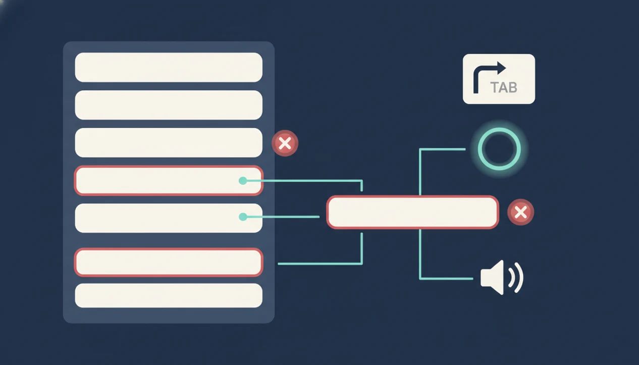
Accessible form labels, focus order, and assistive technology support
Accessible form controls have visible labels and programmatic names that assistive technology can identify, announce, and relate to the correct input.
How accessible form design works: a screen reader does not “see” the form like a sighted user. It uses the accessibility tree, which exposes each field’s role, name, state, and description. A proper `<label>` or `aria-labelledby` connection gives the field its accessible name. Helper text connected with `aria-describedby` can add format rules or privacy notes.
For the underlying WCAG guidance, compare each field against W3C WAI form tutorials and WCAG success criteria for labels, instructions, keyboard access, contrast, error identification, and error suggestion: https://www.w3.org/WAI/tutorials/forms/.
Focus order is the path a keyboard user follows with Tab, Shift+Tab, Enter, Space, and arrow keys. Native HTML controls usually handle this better than custom widgets. Use ARIA only when needed, and use live regions for dynamic feedback such as “3 errors found” or “Volunteer shift field added.”
The most useful accessibility work is boring: labels, order, names, states, and messages that line up.
Accessible forms checklist for labels, instructions, and field structure
People should understand a form field before they type. Persistent visible labels are the starting point; placeholder-only labels disappear, can be low contrast, and often fail once someone starts editing.
Use plain-language labels such as “Parent/guardian name,” “Preferred appointment time,” and “Volunteer shift.” Add helper text for format rules, examples, privacy expectations, and required fields. If you need a phone number in a specific format, say so near the field, not after a failed submission.
Group related controls with `fieldset` and `legend` where appropriate, especially radio buttons and checkbox sets. “Choose one appointment type” helps more than three floating options with no group name.
Collect only what you need. The same principle applies to privacy; data minimization for forms often improves accessibility because shorter forms create fewer barriers.
WCAG form checklist for keyboard access, focus order, and mobile inputs
Can someone complete the form without a mouse? That question should be part of every WCAG form checklist, especially when forms are opened from phones, tablets, shared laptops, or assistive devices.
Test every field, button, select menu, radio group, checkbox, date picker, file upload, and custom component with only the keyboard. The focus order should follow the visual reading order. Focus indicators must be visible, and no modal, calendar, or dropdown should trap the keyboard.
On mobile, choose input types that match the answer: `email`, `tel`, `number`, `date`, and relevant `autocomplete` values. That small detail matters when someone is filling out an order form on a tablet stand beside a ringing phone.
A Pew Research Center report found that Americans with disabilities use a mix of smartphones, desktops, laptops, and tablets, so testing only one device misses real use: https://www.pewresearch.org/internet/2021/09/10/americans-with-disabilities-less-likely-than-those-without-to-own-some-digital-devices/.
Form accessibility checklist for contrast, readable text, and visual states
Readable forms need enough contrast across labels, input text, placeholders, borders, help text, buttons, disabled states, and error messages. Low contrast is not a design mood when someone cannot read the field.
Do not communicate required fields, errors, warnings, or success states with color alone. Pair red borders with text such as “Email address is required.” Pair green success states with confirmation text such as “Your RSVP was submitted.”
Use readable font sizes, comfortable spacing, and touch targets that do not require tiny taps. A cracked phone screen in a parked car is not a formal lab test, but it quickly reveals cramped fields and faint placeholder text.
According to the WebAIM Million report, low-contrast text remains one of the most common automatically detected accessibility failures on home pages: https://webaim.org/projects/million/.
Accessible form error messages and validation checklist
Accessible validation helps people recover without losing their work. Identify each error in text, place it near the affected field, and explain how to fix it.
For longer forms, add an error summary at the top after failed submission. Each summary item should link to the relevant field, such as “Preferred appointment time is required.” Move focus intentionally to the summary or first error, but do not jump focus while someone is still typing.
Use `aria-invalid` to mark fields with errors and `aria-describedby` to connect the field to its error message. For dynamic validation, use live announcements carefully so screen reader users hear important changes without being interrupted on every keystroke.
Avoid validating too early. Also avoid clearing user-entered data after a failed submit. Nothing makes a registration desk feel longer than retyping the same address twice under string lights.
Accessible form design checklist for AI-generated and multi-step forms
AI-generated and multi-step forms need the same accessibility checks as hand-built forms, plus extra review for generated labels, hint text, required fields, accessible names, and dynamic behavior.
How to use an accessible form design checklist:
- Start with the form’s job: Define the action, such as registration, lead capture, quiz, intake, order, or RSVP.
- Review each generated field: Check the visible label, accessible name, helper text, required status, and answer type.
- Test the path: Move through the form by keyboard and screen reader order, including conditional questions.
- Check dynamic changes: Announce step changes, loading states, newly displayed fields, and progress indicators.
- Preview on mobile: Confirm input types, spacing, focus visibility, and error recovery before sharing the link.
An AI form builder app for creating forms, surveys, quizzes, and registrations with intuitive drag-and-drop and smart templates should deliver faster starting points, not a guarantee that every published form meets accessibility requirements.
For deeper review of generated fields, use an AI generated form review checklist before launch.
Four accessible forms myths that cause broken submissions
Accessibility failures often come from assumptions, not malice. These four myths show up in form reviews again and again.
- Myth 1: Mobile-friendly means accessible. A narrow layout can still have missing labels, poor focus order, tiny touch targets, or unreadable error text.
- Myth 2: Placeholders can replace labels. Placeholder text disappears, is often low contrast, and does not reliably give every user a stable field name.
- Myth 3: Accessibility only matters for blind users. Accessible forms also support people with low vision, motor disabilities, cognitive differences, hearing disabilities, and temporary injuries.
- Myth 4: AI form builders automatically guarantee accessibility. AI can draft useful forms, but people still need to review wording, structure, contrast, focus, and validation.
The CDC estimates that more than 1 in 4 U.S. adults has some type of disability, which makes form accessibility a mainstream access issue, not a niche edge case: https://www.cdc.gov/disability-and-health/articles-documents/disabilities-impacts-all-of-us.html.
When to Get an Accessibility Audit for a Form
Get an accessibility audit when a form is high stakes, high traffic, or hard to test with a quick checklist. Payment, healthcare, government, education, and employment forms deserve extra review because a broken submission can block money, care, services, learning, or work.
Custom widgets, conditional questions, file uploads, and multi-step flows raise the risk. Automated scans can catch missing labels and some contrast problems, but they cannot replace keyboard testing, screen reader checks, voice input review, or real assistive technology use.
Before a sensitive launch, use this sequence:
- Identify the risk: Mark forms that collect payments, applications, medical details, school records, employment information, or official requests.
- Review the complexity: Look closely at dynamic sections, uploads, calendars, address finders, progress steps, and custom controls.
- Test with people: Include users with disabilities before a major public release, especially when traffic or consequences are significant.
- Escalate when needed: Bring in legal counsel or compliance specialists for regulated industries, public-sector obligations, procurement rules, or formal accessibility claims.
- Retest after changes: Recheck the form when logic, templates, vendors, or validation rules change.
Limitations
A checklist lowers risk, but it cannot promise that every form is legally compliant, usable, or appropriate for every audience. Treat it as a practical review tool, not a substitute for expert testing.
- A WCAG form accessibility checklist does not guarantee ADA, EN 301 549, or WCAG legal compliance.
- WCAG guidance evolves, so checklist items need maintenance after standards and platform patterns change.
- Automated scans miss unclear instructions, cognitive load, confusing field names, and real-world hesitation.
- Some custom widgets require developer-level ARIA, focus management, and assistive technology testing.
- User testing with people with disabilities is stronger than checklist-only review.
- Strict pass/fail compliance can still produce a poor experience if the content is confusing.
- Forms that collect sensitive information need additional privacy and security review, such as safe online form builder practices or HIPAA friendly form builder considerations where relevant.
Checklists catch a lot. People catch more.
FAQ
What makes a form accessible?
An accessible form has descriptive labels, keyboard operation, readable contrast, clear instructions, and error recovery that works with assistive technology. It should be understandable before, during, and after submission.
Are placeholders accessible labels?
No. Placeholder text should not replace persistent visible labels because it disappears during typing and may not provide a reliable accessible name.
What is a WCAG form checklist?
A WCAG form checklist is a practical translation of accessibility success criteria into checks for labels, focus order, contrast, instructions, keyboard access, and error handling. It helps teams review forms before publishing.
Do forms need keyboard access?
Yes. Every field and control must be operable without a mouse, including buttons, radio groups, checkboxes, menus, dialogs, and custom components.
How should form errors appear?
Form errors should appear in text near the affected field, include correction guidance, and be programmatically associated with that field. Longer forms should also include a linked error summary.
Is color enough for errors?
No. Color alone is not enough for errors, required fields, warnings, or success messages. Use text, icons, patterns, or field-level messages along with color.
Are mobile forms automatically accessible?
No. A mobile-friendly layout does not guarantee proper labels, keyboard behavior, contrast, focus order, or assistive technology support.
How do screen readers read forms?
Screen readers read form controls through accessible names, roles, states, descriptions, and error announcements. Proper labels and descriptions help users understand what each field asks for.
Can AI create accessible forms?
AI can create a useful starting form from accessible templates, but generated fields still need human review and testing. Forms AI and similar tools should be checked for labels, required fields, contrast, focus, and validation before publishing.
How often should forms be tested?
Forms should be tested before launch, after design or logic changes, and when WCAG guidance or platform behavior changes. High-use forms should also be reviewed periodically against current accessibility patterns.